Multi-platform Design Systems
The Question: Episode 7 Wrap-up
On Thursday, December 21 of 2023 we held the Episode 7 design system deep dive conversation as part of a series called The Question. Thanks for being part of it.
Review the FigJam file, the raw data, and the opening music (“Voyager” by Trent Walton) from the Episode 7 deep dive. Major thanks to my friend and design system leader, Jesse Gardner, for co hosting this deep dive!
For the week’s question, I provided this context:
I was chatting with one of our regulars (Hi, Jesse!) about some of the complexity in supporting multiple platforms with a design system. Of course, the word “platform” can mean different things to different people. Some use it to mean a JavaScript framework like React or Angular. Some use it to mean an entire content management syste, like Drupal or WordPress—those are platforms, right? Some use it to draw distinctions between web and native experiences like iOS, tvOS, Android, Android TV.
For the sake of today’s question, I’ll offer this clarity:
A “platform” supported by your design system is one for which you offer unique assets that enable the building of products constructed for/with that platform.
So, if your system offers assets used by multiple teams of React devs to build multiple products, you support React as a platform.
With all of this as context, here is the week’s question:
How many platforms does your design system support?
Which platforms do you support and how are you overcoming the challenges of doing so?
The Question was shared via email (to 196 people), on LinkedIn, and X and I received 31 responses this week.
The Answers
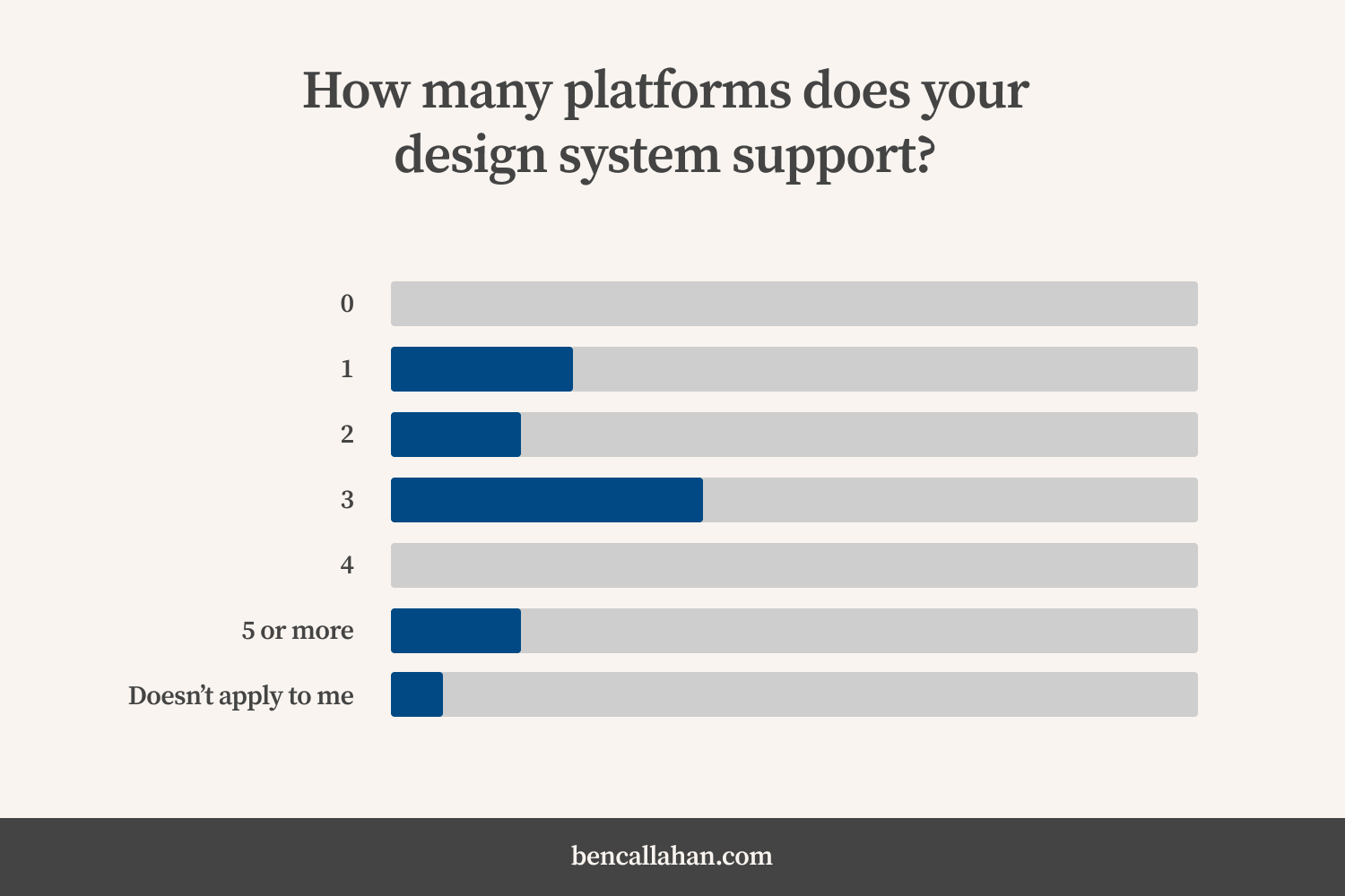
In answer to the first question, approximately 75% of respondents reported their design system supports 1, 2, or 3 platforms:
 In response to the question, “How many platforms does your design system support”: approximately 75% of respondents reported that their design system supports 1, 2 or 3 platforms.
This aligns with what I hear in my conversations with design system leads on a regular basis. There certainly are some organizations that are working hard to support a massive number of platforms (some from our community are supporting over 15). However, this is not the norm.
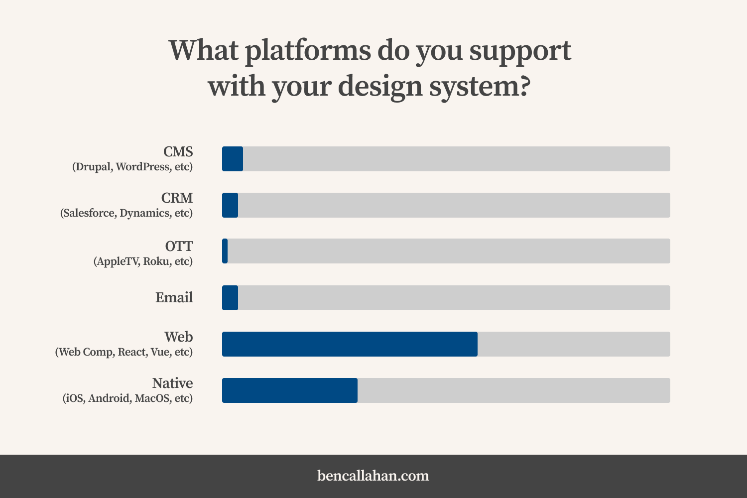
In the second question I asked respondents to share which platforms they are supporting and how they are overcoming the challenges of doing so. I parsed through the open text data I received to generate a few more statistics:
 In response to the question, “Which platforms do you support”: over 85% of respondents reported that their design system supports either web or native platforms.
Not surprisingly, the overwhelming platforms which design system teams are focused on supporting are web (grouping together web components, react, vue, etc.) and native (grouping together iOS, Android, MacOS, etc.). We also had a small number of OTT (AppleTV, Roku, etc.), CRM (Salesforce, Dynamics, etc.), and CMS (Drupal, WordPress, etc.) supporters.
A few other statistics:
- 52% of respondents reported supporting React
- 42% of respondents reported supporting iOS
- 35% of respondents reported supporting Android
- 26% of respondents reported supporting Angular
- 23% of respondents reported supporting Web Components
I also asked ChatGPT to generate a summary of the open text answers and received this back:
The responses outline various platforms supported by different design systems and the challenges faced in maintaining consistency across them. There’s a mix of technologies—React, Angular, web components, iOS, Android, and more—each posing its own set of difficulties:
- Diverse Technologies: React, Angular, web components, iOS, Android, CSS, SCSS, Swift, SwiftUI, Vue, etc.
- Challenges: Maintaining consistency across platforms, managing different technologies, handling multiple versions of frameworks, and accommodating various team sizes and goals.
- Approaches: Using design tokens, Figma for specifications, merging systems, harmonizing releases, focusing on a single platform to avoid challenges, leveraging dedicated teams, debating between different technologies, considering Web Components for flexibility, and struggling with legacy technologies.
The common thread appears to be the struggle to maintain consistency and scalability across diverse platforms, dealing with the limitations of certain technologies, and finding ways to align multiple teams with varying goals.
Several approaches have shown promise in addressing the challenges posed by diverse platforms in design system management:
- Dedicated Teams: Having dedicated engineering and design teams assigned to each platform or technology stack can be effective. This allows for focused efforts, quicker problem-solving, and tailored solutions.
- Use of Design Tokens: Implementing design tokens for consistency across platforms has been successful for many. It helps maintain design integrity while allowing flexibility in platform-specific implementations.
- Harmonizing Releases and Documentation: Aligning release cycles and ensuring consistency across documentation, design systems, and code implementations can mitigate disparities between platforms.
- Focus on a Single Platform: Some teams found success by concentrating on a single platform initially, ensuring a solid foundation before expanding to others. This approach avoids spreading resources thin across multiple platforms.
- Flexible Component Libraries: Creating flexible component libraries that cater to various technology needs within an organization can ease adoption across different teams and platforms.
- Education and Alignment: Nudging teams towards standardized patterns and educating them about the benefits of consistency helps in aligning diverse groups toward a common goal.
The most successful approach often depends on the organization’s structure, the nature of its products, available resources, and the level of flexibility required across platforms. A combination of these strategies might be more effective than a singular approach. Flexibility, adaptability, and continuous improvement seem to be key themes among successful approaches.
I found this to be a really great summary of what folks shared. Thanks, ChatGPT!
Selected Quotes
Here are a few quotes shared by folks (along with some commentary from me) in answer to question two:
“We don’t really overcome the challenges, we need to build these components more times with each new platform…”
Ooof. This succinctly captures the pain involved in trying to support multiple platforms. Attempting to support each platform equally means you’re adding a lot more work and requiring a wide variety of expertise from your design system team.
Some folks are approaching this by offering unequal support to various platforms.
“Right now the only shared assets are tokens since the technologies are incompatible otherwise. We manage the tokens in Figma with Token Studio, then push directly to a mono-repo that parses them into individual JSon files for each platform and light and dark themes. They’re then exported as a private NPM package for consumption.”
A lot of folks have found tokens as an elegant way to offer codified design decisions to any platform through the use of tools like Style Dictionary. These tools allow a team to create a single source of truth for those design decisions and then transform those design decisions into the formats that various platforms consume.
Other teams found that it was people that made supporting multiple platforms possible.
“What makes it manageable is having a dedicated engineering team.”
“Many dedicated developers [is the way we’re overcoming the challenges]. We’re up to about 10 now across all the platforms.”
This more manual approach has the benefit of keeping the design system team well informed about what’s happening across the organization with each platform. It is, however, costly and time intensive.
Other respondents offered some cautionary tails for the rest of us.
“We support Angular, React and Stencil/web components. We are challenged with the need to support 6 major versions of Angular (12-17). It is quite a challenge because we support Angular via web components that use Stencil and Stencil’s Angular output target package. Ultimately, I believe our design system is a bit of a cautionary tale of scaling too fast. Engineering and design mandates have required adoption of our components across our organization has made our mission of delivering the best components with a focus on performance and developer experience very difficult. While any design system team would probably celebrate the level of adoption we’ve had in a year, it is happening faster than our little team can adequately support.”
“The problems have been largely people-based and not tech-based. Each”platform” has their own set of PMs with their own goals, often career goals. Finding common ground has been hard. What I’ve seen being somewhat effective is constantly finding outliers and nudging them towards either contributing that as an official pattern or showing them there’s a better way.”
“From the beginning of our system it was decided that React was the way to go, because it was widely used by the product teams in the organization. However, the challenge we’re facing now is that the teams that don’t use React, cannot adopt the design system. This is happening both internally and especially with external partners. This is causing them to rebuilt components using our documentation, but costing so much time and money, that it’s doing the opposite of what the design system is for. Abandoning React for something like web components at this stage seems like too steep of a hill to climb. Especially because we have to keep maintaining the current system for our current subscribers at the same time. We’re also not sure if we even need to support those teams that don’t use React internally or if they would benefit from switching to React so they can adopt the system.”
“We haven’t been equally staffed across the platforms we’ve promised to support. And, some platforms come more from contributions than the others. So, we (our design and our various code implementations) are out of sync.”
There were also a number of folks who have found a workflow that allows them to support multiple platforms through a tool called Stencil. The concept here is similar to the token workflow described above, only here it’s with components instead of groups of design decisions. Stencil is a compiler that takes your components and turns them into Web Components for use in platforms like Angular, React, Vue, or vanilla JavaScript.
“Our Web Components platform is not really consumed directly by teams. Instead, it is used to output React and Angular versions of components through Stencil that provide much better support for the platform it is used in.”
“We currently build on Stencil.js and support web components, React and Angular. We cannot mandate what technology any team within the organization uses, so we have tried to create a flexible component library that can meet most teams’ needs. We have struggled with some legacy technologies trying to use design systems.”
I also loved this comment from one respondent on simply using CSS as a multi-platform support choice:
“Shipping CSS only as an option was our strategy, and has been successful. It’s a common language across the majority of platforms. The company I work for is so large and global (our target for full adoption is 500+ products maintained by thousands around the world), and our team is so small, we had to find a common denominator (CSS). It’s interesting to see how framework popularity can be regional. For example, our European teams are 80% Vue.”
While revisiting my notes from this deep dive, I saw a post from my friend Nathan Smith with a similar thought:
“CSS hot take: I’m beginning to think any design sysetm that exposes style values via anything other than CSS variables is essentially doing it wrong.”
“There is one correct, modern way to manage CSS variables: Use CSS variables. ’Nuff said.”
Of course, this is an intentially controversial stance, but one that resonates with me for sure (especially if the focus of your system is the web).
High Gear vs Low Gear
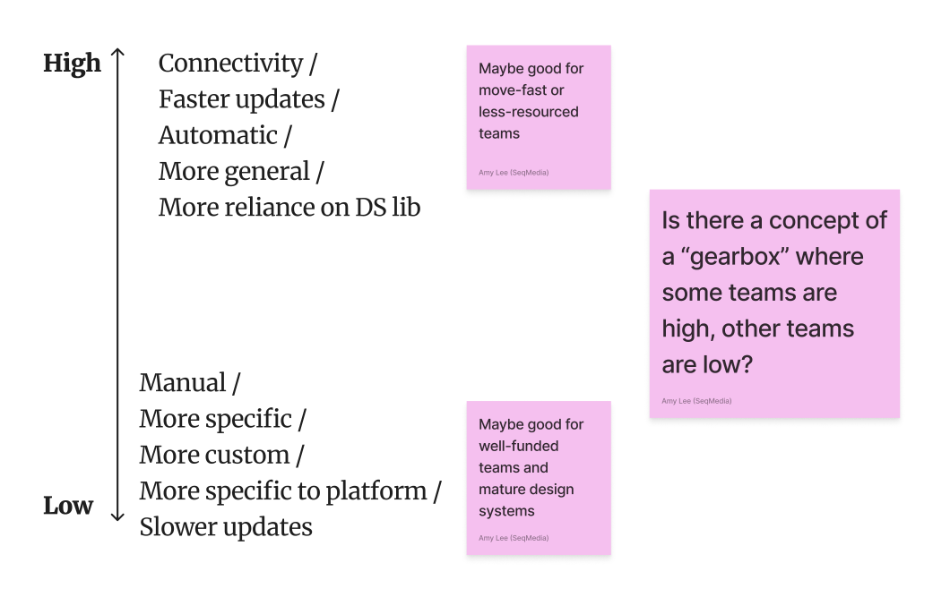
During the deep dive, one of our community members (Hi, Amy!) sketched an idea that highlights the spectrum of approaches a design system team can take to support multiple platforms. The spectrum runs from “high gear” on the top to “low gear” on the bottom.
 Amy Lee shared the concept of high-gear vs low-gear approaches to managing mutiple platforms with the same design system.
Higher gear multi-platform support:
- means the systems are more connected
- implies more use of automation
- results in faster updates
- forces reliance on the DS Libraries
Lower gear multi-platform support:
- means the work is more manual
- allows for a more nuanced/custom approach
- results in slower updates
Amy suggested that high gear multi-platform support might be good for teams that need to move fast without as much resourcing. Conversely, low gear multi-platform support may be a good option for well-funded teams and more mature design systems.
She also hinted at the idea of a “gearbox” which would allow a larger team to operate across this spectrum. I love the idea that we leave room for operating along this spectrum and don’t isolate our approach to only one end.
In Conclusion
I’m encouraged to hear how teams are finding ways to solve the same problems in so many different ways. This is just proof that what works for one team won’t necessirly work for you. It also shows just how valuable a community like this is. I can’t stress enough how informative these deep dive conversations are. It’s refreshing to hear how others are approaching these challenges.
Additional resources
- Creating multi-channel multi-theme connected libraries in Figma (by Jack Minogue, Andreamorgan Mattheeussen, and Ryan Larish)
- Lightning Web Components (by Christophe Coenraets)
- Design Systems Should be JavaScript Framework Agnostic (by our own Jeff Pelletier)
Thank you
Many thanks to all who participated.
If you missed out this week, sign up for The Question and be ready to answer next time.
Writing Design Systems The Question
Join Redwoods, a design system community.
Sign up for The Question, a weekly design system deep dive.
Explore more of my writing and speaking.
Or, inquire about design system coaching