Design Systems: What to Work On
The Question: Episode 35 Wrap-up
On Friday, October 25 of 2024 we held the Episode 35 design system deep dive conversation as part of a series called The Question. Thanks for being part of it.
 Elyse Holladay and Ben Callahan were co hosts for this episode of The Question, facilitating a deep dive discussion on what to work on in your design system program.
The Question was shared via email, on LinkedIn, and X and I received 69 responses. Review the FigJam file, and the raw data, and listen to the opening music (“I’ll Always be Waiting for You” by Sainte Barbe) from the Episode 35 deep dive. Major thanks to my friend and design system leader, Elyse Holladay, for co hosting this deep dive!
For the week’s question, we provided this context:
Elyse and I have been discussing the fact that a lot of design system teams seem to be stuck in the never-ending cycle of “build more components!” When I chat with design system practitioners one-on-one they seem to know there’s much more to the work than this. So why is it that our backlogs are full of more and more components?
This week, we’re going to try to uncover what is driving the prioritization of work. Hopefully, we can start to break out of the mindset that there is one right way to build a design system and free ourselves to figure out what would most benefit the organizations and cultures in which we work.
In order to join the deep dive, all you have to do is answer The Question:
- Overall, do you feel your design system team is doing the right work?
- What should the number one top priority for your design system be right now (and, are you working on it)?
- What is your design system team currently working on that you believe is not valuable (and, why are you working on it)?
See you on Friday!
The Answers
From past conversations I’ve had with design system teams, I know a lot of folks are feeling like they don’t always get to work on the things they believe are the top priority. With this in mind, we offered an impromptu poll at the beginning of the deep dive to assess whether folks felt like they have the autonomy to make decisions about what the design system team works on. The majority of answers were either “Yes” or “It’s complicated.”
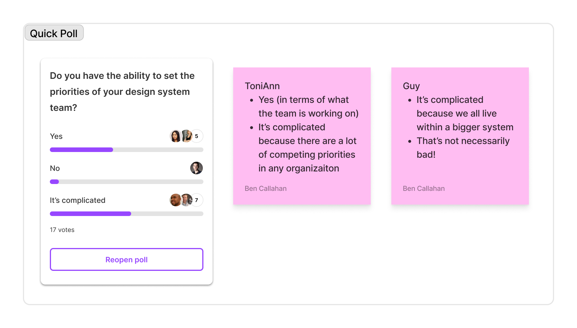 When asked if they have the ability to set the priority of design system work, a majority of respondents reported that they do or that it's complicated.
We dug in a bit with those who answered, “It’s complicated” and heard some clarification from a few folks:
- ToniAnn shared that she does get to set the daily work of the team but also that there are always competing priorities at any organization.
- Guy said “It’s complicated because our design systems all live within bigger systems (our organizations).” We agreed this isn’t a bad thing, just a reality of the work.
I wasn’t sure what to expect from the first official question. When asked if they believed their design system team is doing the right work, 61% of respondents answered “Yes” and 26% answered “No”. Keep in mind, this data is not intended to be statistically significant, only to get a conversation started.
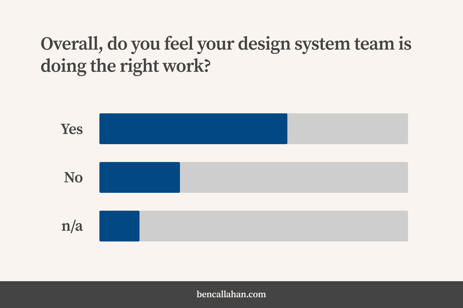 When asked if they believe their design system team is doing the right work, 61% of respondents answered 'Yes' and 26% answered 'No'.
The idea that over a quarter of those who answered feel their design system team isn’t working on the right stuff is a bit concerning, for sure. We used the rest of our time to try and understand why that is and what we could do about it.
The Conversation
The conversation started off with Elyse issuing a bit of a challenge. She suggested that maybe we are all operating with some assumptions about what a design system is that need to be confronted. I think most of us would agree that there are a lot of ways to help an organization work more systematically. This challenge was a way to surface the idea that these assumptions most certainly bias our approaches.
Folks shared a few assumptions they had worked through in their journey:
- The assumption that a design system has to be custom designed and built components (instead of a third party system)
- The assumption that every design system needs a specific set of components
- The assumption that the ultimate goal is 100% adoption
- The assumption that every design system needs tokens
Defining Priorities
ToniAnn shared that she and her team are in the midst of setting 2025 priorities and asked if folks had experience to share that might make this easier. We heard a lot of great responses to this question, here are a few:
- Adrianne shared: “Informal feedback has been a nice indicator for us (in addition to formal feedback in the form of surveys, interviews, usability studies etc).” Check out the quick example she put into the FigJam as well!
- Erin shared: “We gathered a lot of data, based on consumption numbers and level of impact for customers, to determine which things we should prioritize.”
- Noelle shared: “Currently working on establishing design intake process and then from there a way to weigh asks based on impact and ease of implementation to try to get long term and short term goals done.” She also referred to Alexander’s article for inspiration.
Diminishing Returns
One answer in particular stood out to me. This was an individual who answered that they didn’t feel their design system team was necessarily working on the right stuff. Here’s how they described the situation:
“There is a focus on adding more components to the system, particularly within the mobile space; this is driven by an oversimplified view of the value the design system brings from our leadership team. Our current component coverage covers most of our use cases; adding new components now has diminishing returns. We should have a greater focus on adoption.”
The idea that simply continuing to add more and more components offers diminishing returns rang true to me and to many other participants. As I was preparing for the deep dive, this idea kept resurfacing in other answers as well. I sketched a diagram to help illustrate this concept.
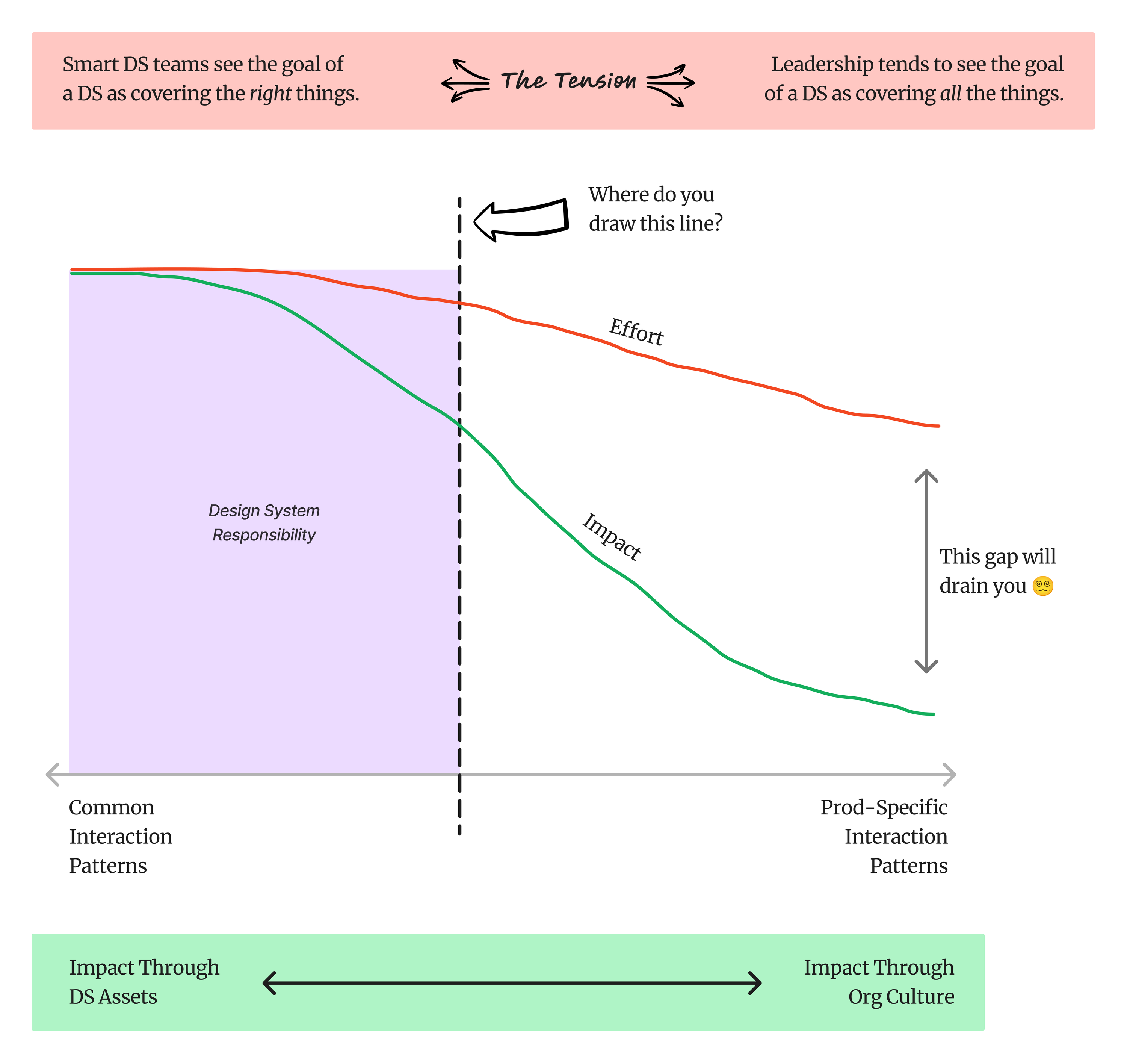 A diagram seeking to illustrate where the responsibility of a design system team should start and end on a spectrum from common interaction patterns to product-specific interaction patterns.
At the top of this illustration, I’m calling out the tension I heard expressed in a lot of the answers to The Question this week. It’s a tension between design system teams and the leaders they report to. I stated it in this way:
“Smart DS teams see the goal of a DS as covering the right things while leadership tends to see the goal of a DS as covering all the things.”
This is such an important distinction. Design systems thrive in the overlap between products, not in giving product teams assets to cover every possible need they might have. The graph is my attempt to illustrate this by showing an x-axis that spans from “Common Interaction Patterns” meaning the interaction patterns that are common to all potential DS consumers (on the far left) to “Product Specific Interaction Patterns” meaning interaction patterns that are unique to a specific product (on the far right).
Across this axis I plotted two lines—one for the amount of effort (in red) and one for the amount of value (in green). The line for effort starts high on the left side and drops a bit by the time it reaches the far right, indicating that the amount of effort is a bit higher to build something that can work for all use cases (far left) vs something that only works for one use case (far right). However, when you consider the value against this same x-axis, it’s much higher on the far left and much lower on the far right.
Now, this may be controversial, I can think of instances when this may not be true. If you only have one product there isn’t much difference in the value between left and right (but then again, why are you building a design system if you only have one product?). Or, if you have a flagship product that brings in 98% of your revenue, the calculation of “value” is likely skewed by that all-important revenue monster. :)
In most cases, however, I think this graph holds true. And it illustrates the diminishing returns of adding more and more components once you have coverage for the most common ones.
The next part of the chart is a purple box covering the left side of the graph. I have this labeled as “Design System Responsibility” implying that the stuff on the left (the common patterns) is where we should focus the responsibility of the DS. I posed the question, “Where should we draw this line?” in an attempt to make us think a bit about what the scope of responsibility should be for a healthy design system program.
Some Disagreement
I believe most of us intuitively understand this diminishing return, but I’ve always been someone who believes design systems can actually make an impact out on the right. My thinking is (and my research around organizational culture shows) that the assets we offer our consuming teams will only get them so far. To create value out on the far right of this graph, we need individuals to make decisions that align with the ideals of the design system. That is culture work, not Figma or React work.
This part of the illustration really sparked some discourse. Some participants felt that it is the responsibility of the design system program to help product teams release product specific stuff in a more cohesive and efficient way. Some felt the responsibility should stay further left (as it is in the original illustration). This conversation led me to create a second version of the illustration with the assumption that the whole spectrum is the responsibility of the design system program.
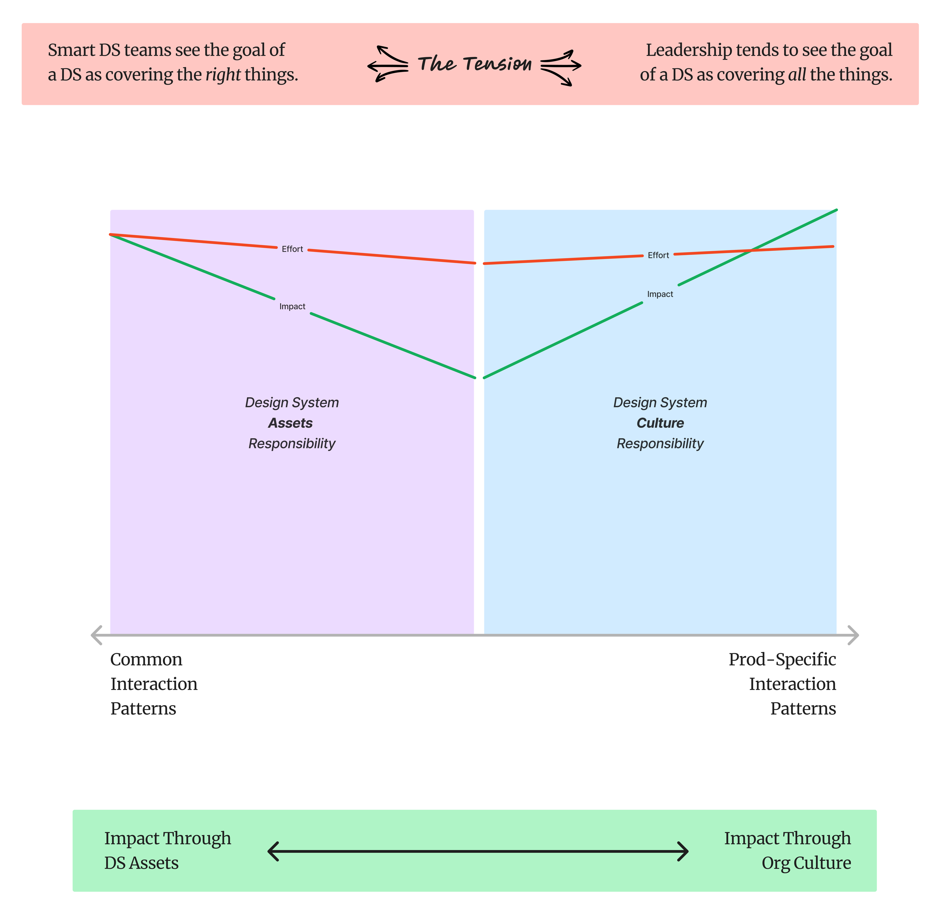 An alternate version of the illustration showing the responsibility of a design system team spans the spectrum from common interaction patterns to product-specific interaction patterns.
In this diagram, the effort and value lines are a bit different. I can speak about this one with a bit of confidence because this is actually more how I (and my team at Sparkbox) approach our design system work. We have learned that the highest impact work in a design system program is actually changing hearts and minds (shifting culture) to value the benefits the organization hopes to see from the design system. For this reason, we engage along two paths. The first is a very tactical path (left side) and the second is a very strategic path (right side).
The tactical path of work involves us bringing a team of designers, developers, project managers, and all-around systems thinkers alongside our clients’ teams. In this work, we build out foundations, tokens, core systems, components, and patterns that serve a broad swath of use cases for consuming teams.
The strategic path of work involves cultural analysis, building a coalition of leadership, and establishing a change and communication plan. This work is about story telling and illustrating how an organization delivers high quality, cohesive digital interfaces in an efficient manner at scale.
Together, this is a powerful combination because it addresses the tension we discussed earlier. Leadership (the coalition) is now involved in the work and has an opportunity to understand how we solve for cohesion and efficiency in different ways across the spectrum in this diagram.
What’s really ironic about all of this is that many design system programs start by picking an important product and prioritizing some feature which that product needs. I understand this approach to prioritization. But I also think it often results in building assets that are really far out on the right of this spectrum, where the impact should be made with culture. It’s not that a design system can’t offer these kinds of assets, it’s just that the value of them drops significantly because they only serve the needs of one product team.
One Step Further
I’ve continued to noodle on these diagrams a bit, eventually landing in a place where I commonly land—a four-quadrant diagram :)
Along the x-axis, I have the same far left, “common interaction patterns” and the far right, “product-specific interaction patterns.” I’ve added in the y-axis to span from more tactical design system assets (at the bottom) to more strategic design system culture (at the top). Here’s what it looks like:
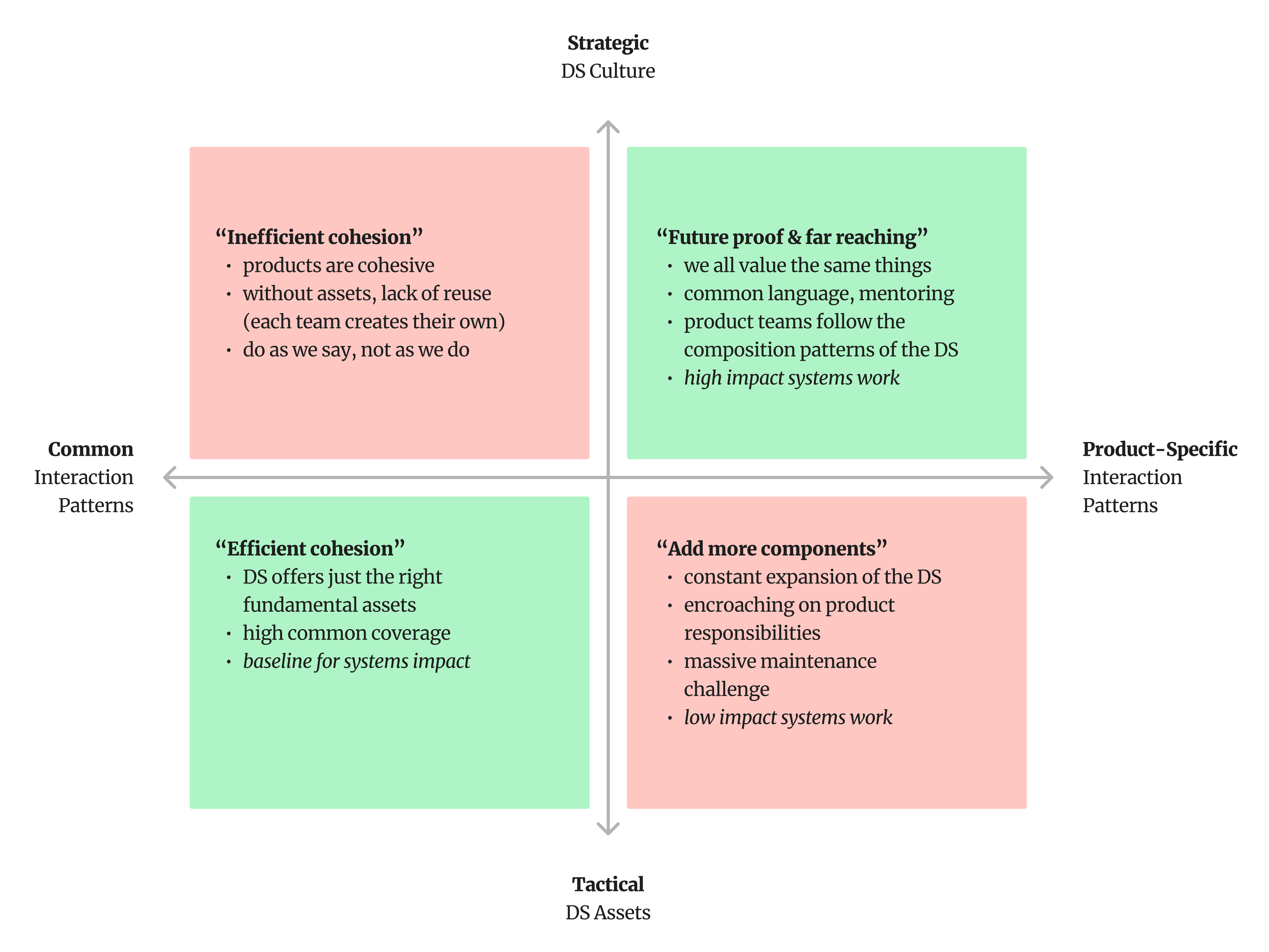 Another way to consider these ideas—four quadrants showing how tactical work is more helpful for common interaction patterns and strategic work is more helpful for product-specific interaction patterns.
I like this framing because it helps us to see the result when we’re focused on only one of these approaches (tactical vs strategic). This is shown by the characteristics in the top left (using only a strategic approach to solve common interaction challenges) and the bottom right (using only a tactical approach to solve product-specific interaction challenges). The top left can work, but without the assets common to many design systems, the cohesion we get is very inefficient because each team has to create those things for themselves. The bottom right is where the diminishing returns conversation happens. These teams will chase an unending list of assets trying to solve every interface problem for every product—clearly an unsustainable approach.
The bottom left is where more tactical assets (tokens, components, layouts, etc.) are used to solve interface challenges common to all products. The top right is where more strategic methods (cultural change, storytelling, winning hears and minds) are used to shift the values of individual designers and developers resulting in far-reaching cohesion.
Combining these two (bottom left and top right) is where we get meaningful impact across an organization.
Creating Visibility
After the lengthy discussion about these diagrams, Guy pushed us in an interesting direction by suggesting that we (the design system team) may know something is valuable to the org, but they (the rest of the organization) may not see that value. The question he posed was, “What are the things we’re doing that the org doesn’t see value in?”
The answers ranged from education and training resources to foundations and primitives. And, of course, the paying back of technical debt was brought up a few times as was research and feedback. Liliana shared that she’s had success at showing value in these kinds of things by connecting them to a larger mission and vision of the design system program. There’s a lot of wisdom in this idea!
Learning Mode
I am continually inspired by the people who show up week after week to dive into the answers we gather. Every participant comes in learning mode. Because of that, we all walk away with broadened perspectives and an appreciation for the experience we are all bringing to these conversations.
To those of you who attended, thanks for joining with such a gracious posture.
Additional resources
- Prioritizing Design Systems (by Alexander Fandén)
- Design System Contribution Criteria (by Nathan Curtis)
Thank you
Many thanks to all who participated.
If you missed out this week, sign up for The Question and be ready to answer next time.
Writing Design Systems The Question Featured
Join Redwoods, a design system community.
Sign up for The Question, a weekly design system deep dive.
Explore more of my writing and speaking.
Or, inquire about design system coaching